Posts

Mock

"How far can aspects of identity be seen to affect the way in which audiences use online media? Discuss, with reference to Zoella and Attitude" (30) PLAN - Intro (people forming identity through the ideologies presented by each product, strongly affect the use) - Para 1 (mention GAUNTLET pnm theory, how hyperlinks and interactivity allow for people to choose what they are watching, articles etc.) - Para 2/3  (use examples from Zoella apartment and holiday/cult beauty blog posts, how she presents an ideology of lifestyle and beauty, conforms to gender hegenomy, also BEGER theory of men act, women appear and BEUDRILLARD and post-modernism as she is creating a hyperreal lifestyle) - Para 3/4  (use examples from Attitude magazine of their exercise posts and fashion or the article on body image #queeraf and theatre section, how they target an audience described as 'gay professionals' and construct an ideology around expensive brands due to expendable income, B...

Attitude: Industry and Audience

Image
Publishing info: - Published by Stream Publishing Ltd - It seems to publish a range of titles that are mostly for travel companies (free handouts that people can read), however they also publish another gay magazine, called 'Winq', which is luxurious. - They acquired 'Attitude Magazine' in order to eliminate competition, an example of horizontal integration -  'winq' is a Dutch magazine which is an example of internationalisation where corporations can sell more copies of magazines which they have already produced - They are an independent publisher - The new website was only set up in 2014 1/3 of magazine revenue comes from advertising , which is essential to keeping the cover price of magazines down . This is also reflected in the amount of advertisements on the Attitude website. Print circulation for 'Attitude' magazine sits at around 50,000 , whereas the online circulation sits at 12,207 . However, the amount of online users comes to 1...

Attitude Online

Image
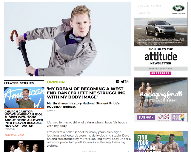
- Main image is stereotypical of a homosexual man, with the posed face and the mise-en-scene of bow tie - The subject of the image is staring out of the photograph, and this positions the audience to feel challenged, and the article is challenging people's ideologies - Intertextuality of the image referring to 'Singing in the Rain' - Anchorage of the title juxtaposes the stereotypical confidence of a homosexual man, and also makes him more feminine, as it is typically hegemonic of women to portray these feelings - Sans serif font is very simple and bold, and makes it easy to read and understand - Colour scheme is basic with white background and small coloured accents, connotes to LGBT flag - Use of green folio (category) helps reader understand what section of the website they're using - They target a British, Gay, male audience as the ideologies are clearly presented through the topic of the article - Uses the #QueerAF podcast within the article which assume...

Online Algorithms

Image
Some videos on YouTube are created using an algorithm in order to generate content that is popular , and will emerge through auto play. People will use the algorithm in order to make the videos, however the producers are using that algorithm's 'advice' to generate content that will be frequently viewed in order to make money . This means that the videos aren't overly entertaining and sometimes they use children's content mixed with horrible imagery which eventually traumatises innocent children who click on them not realising what they will be, or that are even auto played due to the key words used to describe it. However, the algorithm WORKS - this means there are always going to be clicks which then generate money. IS ZOELLA USING AN ALGORITHM? - The use of brands in the title of her videos as well as the thumbnails in order to generate more clicks as they are popular - Zoella's face in every thumbnail is almost identical, always a smile and it mak...

Regulation

How does LNWH abide by OFCOM's regulatory framework?  "ensure a wide range of services and a wide appeal is available"  - LNWH is very specific however it is a different genre and appeals to niche audiences  "maintain plurality in broadcasting"  - although it is largely middle class, it gives a taste of other cultures and brings in a range of subjects people can relate to "protect audiences from offensive or harmful material" - they do swear in other episodes, however this particular one was cushy and not offensive or harmful at all "protect audiences from unfairness or infringement of privacy" - nothing majorly personal is portrayed on the show and they do not go into other people's personal business DIVERSITY AND CREATIVITY IN THE MEDIA - CURRAN AND SEATON  - people are driven by profit and power therefore limiting diversity - BBC however not driven by this is they don't rely on advertising  - by ...

Zoella

Image
TWEETS 2010 - Zoella tweets homophobic and rude things about other people - Makes her out to be entitled - Breaks the hyperreality as she is no longer her cutesy brand 'Zoella', but she is now a normal person making mistakes being Zoe Sugg THE ZOELLA APARTMENT Conforms to hegemonic standards of beauty Aims for an extremely specific audience The close up angle and casual mode of address is more personal Rented A WHOLE FUCKING APARTMENT to launch her products  Mini increases her cultural capital White and pink colour scheme again reinforces her 'innocent' branding Commodity fetishism of her own brand, adds to the negative stereotype that woman are dumb and pleased by simple things, as her fixation on the packaging is a shallow attempt at selling her product to a young and impressionable audience Her pug is like her child, adds to how she doesn't want to grow up and her childish aesthetic Uses multiple references to things and people in her life that yo...

Exploring Identity

Image
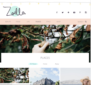
Zoella vs Tanya Burr Zoella -  - Childish, sans serif fonts with pastel colours - Basic use of vocabulary suggests a young audience - Capitalisation of titles and relevant thumbnails are easy to understand and navigate - Presents an aspirational view of adult life, with many photographs being used for aesthetic purpose - Many hyperreal representations of drink, holidays and other situations - Lots of hyperlinks to products in order to buy, leads people down a 'rabbit hole' - Very easy to navigate with a plain user experience - Animated fairy lights add to/symbolise her girly aesthetic, as well as the use of pink and white - Often posts her room and things like that and this makes her seem like an adult trying to cling onto her own childhood Tanya Burr -  - Similar layout is again easy to navigate and has a nice user experience - Serif font presents her much more sophisticated and grown up - Male gaze theory could be applied here as she posts many photos of...