Adbusters
Detournement - Hijacking or re-routing, and could say "Culture Jamming"
'Culture Jamming' is the practice of criticising and subverting advertising and consumerism in the mass media, by methods such as producing advertisements parodying those of global brands.
ADBUSTERS:
'Culture Jamming' is the practice of criticising and subverting advertising and consumerism in the mass media, by methods such as producing advertisements parodying those of global brands.
ADBUSTERS:
- GENRE: not immediately clear, however it seems like satire or black humour. It is dark, and possibly even very critical of the world. Many of their articles are parodies. It is also very political. It is independent, and also campaigning, as well as culture jamming.
- BRAND IDENTITY: Simple, informal mode of address. It is mainly images, with short mastheads which are straight forward. They are not the same or consistent, and therefore builds a more specific audience. Barcodes are all in different places and this also varies design.
- ADBUSTERS DOES NOT FEATURE PAID ADVERTS.
- PUBLISHED: Bi-monthly
- COST: £10.99 - this is due to the fact that they do not have paid adverts and they do not generate income from adverts like other magazines. It is not for profit and therefore all income goes into making new magazines.
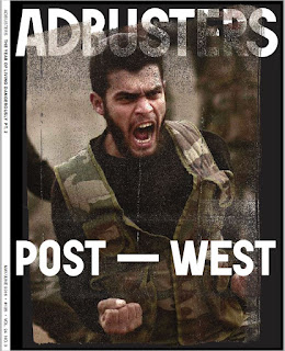
FRONT COVER ANALYSIS:

- Mid-shot, positions the audience in the same place as the subject in the photo
- Cover line evokes thought and makes the audience think about politics which could be involved
- Hermeneutic code is displayed within the title
- Proairetic code is presented here within the man's pose and camouflage vest
- Pushing hegemonic ideologies of men, as here he is represented as defending the country
- Poster-style representation of the magazine is reminiscent of army posters
- Typography and font is basic and simple, as though they are trying to get a message across as easily as possible
- The subject is excited for war, and this brings about the feelings of how nowadays we are, as a culture, obsessed with war
- Distortion of the title is a type of self-vandalism, as though they don't care what people think about them
- Bold and in-you-face, as though the subject may be commanding the audience to buy their magazine
- The message of the magazine is confusing and unclear
- It is subverting conventions of magazines
- Masthead changes with every issue
- The subject of the photograph subverts convention because he is not posed and he is not sat in a studio or made up perfectly
- Hermeneutic code here attracts the audience because we want to know why he is posed in this way and what he is doing
- Cover line 'Post-west' is written in the same font as the masthead and this could make new buyers think that it is the name of the magazine. It is unclear, dominantly positioned and there is anchorage of the image, and then this is unconventional
- Intertextuality of this shown through the links to 'post-truth' and is assuming knowledge
- The front cover lacks conventions, such as barcodes, price and other article snippets. This links to how the magazine is independent and subversive

Comments
Post a Comment