Newspapers
Features of Newspapers:
- Front pages usually always contain large text with an important and central headline
- It's structured and often set out so that there is much more emphasis on the head text rather than images
- It is different to a magazine because magazines have more emphasis on a main photograph
KEY TERMS:
- Masthead - Title of a newspaper
- Barcode - Used to scan a newspaper when purchasing
- Caption - Brief text underneath an image describing the photograph or graphic
- Headline - A phrase that summarises the main point of the article
- Main Image - Dominant picture, often filling much of the front cover
- Page Numbers - A system of organisation within the magazine, helps the audience find what they want to read
- Target Audience - People who the newspaper aims to sell to
- Pull Quote - Something taken from the article
- Classified Advert - Advertisement that only uses text
- Skyline - Information panel on the front page that tells the reader about what is inside
- Edition - Some newspapers print several of these every night, these are versions with some changes and maybe additional late stories
- Stand First - Block of text which introduces the story, normally in a different style to the body of text and headline
- Byline - The line above the story giving the authors name, sometimes the job and location
- Body Text - Also known as a copy. Written material that makes up the main part of the article.
- Standalone - Picture story that can exist on its on or on a front page leading to a story inside
- Centre Spread - A photograph, often in full colour, that runs across the middle of two pages.
- Lead Story - Main story, usually a splash
- Gutter - The blank space between the margins of facing pages
- Folio - Top label for the whole page
- Page Furniture - Everything on the page except the pictures of text of stories
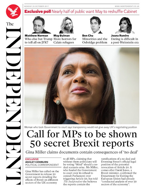
To begin with, nearly all of the fonts on this cover are in a serif font, which has connotations of something being smart or formal. This particular newspaper has a target audience of people who are more middle class, and therefore the font selection reflects this. The headlines also include very formal lexis, and therefore this once again reflects the way that their audience is of a higher class. Not only do the headlines include this type of lexis, but so do the quotes in the skyline at the top of the cover. Another thing is that the main image is taken from a low angle, and therefore could suggest that the woman has power, and displays how this newspaper portrays more powerful people rather than everyday celebrities. There are only three main colours used here (red, white and black) and the colour red is very symbolic of royalty, and once again this could link to the way that the newspaper only concerns itself with matters such as parliament or royalty.


Comments
Post a Comment